Michael Beveridge
Plan Fit: Building Decision Support for Medicare Plan Selection
A case study in data science, iterative model design, and AI-assisted development.
My role
Spark Product designer working as explorer and advocate. I owned discovery, data modeling, and tool design for Plan Fit. This was a personal challenge first and a formal project second: I wanted to dig into CMS data, build my own database, and create working tools that wouldn't have been possible for me a year or two prior. I worked with Claude Code as an AI development partner (Python, business logic, data validation) and leveraged enrollment data from our internal data team for validation. My contribution was the end-to-end design of the scoring model, the elimination logic, and the validation approach - learning by building. UX/UI implementation is currently in progress.
The Problem
Medicare Advantage is the private-plan alternative to government-run Medicare, covering over 30 million Americans. Each year during open enrollment, beneficiaries choose from an average of 40+ competing plans, each with its own premiums, copays, deductibles, drug coverage, and supplemental benefits.
This isn't just insurance shopping. It's the most important post-retirement financial decision most Americans will make. Unlike employer-sponsored health insurance, where HR departments vet options, Medicare beneficiaries navigate this complexity alone. The choice they make affects not just healthcare costs, but their financial security for the remainder of their lives.
Most people choose poorly. Research shows that 90% of beneficiaries select a suboptimal plan, overspending an average of $1,260 per year. Across the Medicare Advantage population, that adds up to roughly $42 billion in annual waste. This isn't from fraud or inefficiency, but from people picking the wrong plan off a list.
The problem isn't that beneficiaries don't care. It's that the decision is genuinely hard. Plans differ across dozens of dimensions: monthly cost, out-of-pocket maximums, specialist copays, drug formularies, dental and vision benefits. While comparison tools exist, understanding what to focus on and how to weigh complex risk-reward tradeoffs against personal health needs remains overwhelming. Most people default to the lowest premium and hope for the best.
Even licensed insurance agents, who sell Medicare plans for a living, struggle with this complexity. The best agents produce outcomes roughly twice as good as the worst. The majority fall somewhere in the middle, doing their best with the same overwhelming plan data their clients face.
In 2020, a research team demonstrated that AI-powered decision support for agents could reduce beneficiary overspending by $278 per year and double the rate of optimal plan selection. The finding was clear: give agents better tools, and outcomes improve dramatically. But as of 2025, no one had built and deployed those tools.
9 out of 10 beneficiaries left money on the table and for most of them, it wasn't a small amount.
The Concept: An Intelligent Shortlist
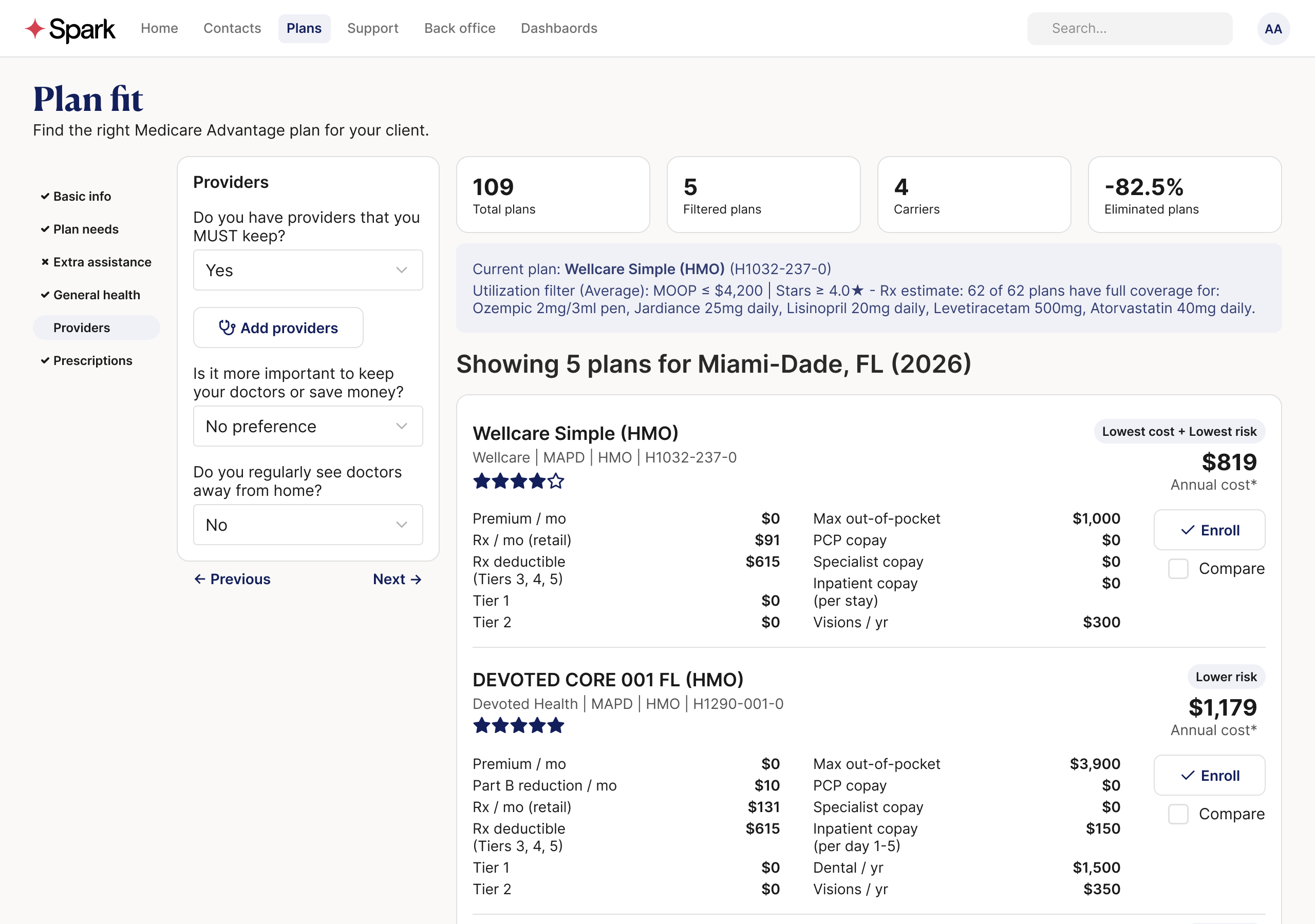
The typical approach to plan selection is comparison: lay out the options and let people choose. Plan Fit takes a different approach. Instead of helping someone choose from 40+ plans, systematically eliminate the ones that are objectively worse until only reasonable options remain.
This isn't about picking winners — it's about removing losers. The goal is an intelligent shortlist of plans that aren't objectively worse than other options in the market. We're not making recommendations; we're filtering out plans where another option is clearly better on every dimension that matters.
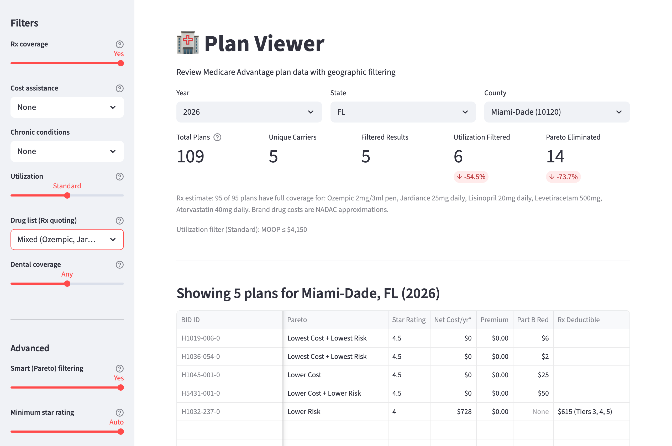
The system works iteratively. Start with all eligible plans in a market. Apply Pareto elimination to remove dominated options — if Plan A is cheaper and lower-risk than Plan B, there's no reason to consider Plan B. This typically eliminates 80%+ of options without requiring any preference input.
As new requirements are added (drug needs, provider preferences, benefit priorities), the system filters and re-runs Pareto elimination on the remaining set, generating a new shortlist. The process rarely produces a single "best" plan. Instead, what emerges is a handful of reasonable options that represent genuine tradeoffs — plans where choosing one over another requires giving something up.
Remove plans that are objectively worse until only a handful remain.
Building the Foundation: The Raw Data Discovery
I knew CMS published comprehensive Medicare Advantage data and wanted to understand how platforms like Medicare.gov and SunFire used it. My assumption was straightforward: the CMS data had everything I'd need to build my own Medicare Advantage plan database, so I decided to do exactly that.
Having plan data and knowing what to do with that data are two separate challenges. Building a comprehensive drug formulary database, for instance, wasn't useful without access to negotiated drug prices — something only platforms like Medicare.gov, SunFire, and Connecture have through direct carrier relationships.
But the core plan comparison data was all there in CMS files. The question was whether I could build something more transparent and mathematically rigorous from the source data itself.
CMS publishes everything you'd need to compare Medicare Advantage plans: benefits, costs, drug formularies, star ratings, service areas. But it's scattered across dozens of files in inconsistent formats. No single download gives you a usable picture. The first task was turning that raw material into something queryable.
What I expected to find: Clean, normalized plan data that existing tools were just presenting poorly.
What I actually found: A deliberately fragmented data ecosystem. The Plan Benefit Package (PBP) files contain cost-sharing structures but not service areas. The Crosswalk files show plan transitions but not benefits. Star ratings live in a separate file with different plan identifiers. Drug formularies reference plan IDs that don't appear in other datasets until you cross-reference through multiple intermediate files.
This fragmentation isn't accidental, it reflects how Medicare Advantage actually works. Plans are built from modular components (benefits packages, service areas, provider networks) that carriers mix and match. But it means no single source contains enough information to properly compare plans.
The technical challenge became a data archaeology project: I spent months building ETL pipelines to reconstruct complete plan profiles from scattered CMS sources, validating the joins, and discovering edge cases where the same plan had different characteristics in different files.
I built a SQLite database consolidating CMS data into a single local store: 8,000+ plan-segments across 3,000+ counties, star ratings, and drug tier structures. On top of that, a Python library for querying, filtering, and scoring plans, and Streamlit applications for interactive exploration and plan comparison.
This was a one-person project, and I wore multiple hats: researcher excavating the CMS data structure, data analyst building ETL pipelines, and model designer creating the scoring logic. This wasn't about operational efficiency — it was about a single-person team tackling whatever needed to be done to make progress.
AI was the right tool for building the system, but the wrong tool for answering the questions the system needs to answer. I used Claude Code as a development partner throughout - writing the ETL pipeline, building the Python library, working through business logic decisions. But Plan recommendations need to be deterministic and auditable - grounded in actual plan data, not generated. A generative model can help you write the code that compares 8,000 plans across dozens of dimensions; it can't reliably do the comparison itself. Knowing where that line is shaped every decision in this project.
The First Model: Elegant in Theory, Harmful in Practice
The Pareto concept is straightforward: if Plan A beats Plan B on every dimension you care about, there's no reason to consider Plan B. It's dominated. The challenge is defining the right dimensions.
For the first model, I chose three axes: net cost (what the plan costs you annually), risk exposure (how much you could owe if something goes wrong), and supplemental benefits (dental, vision, hearing, and other extras). This seemed like an obvious framework. CMS gives carriers a fixed revenue pool per member, and carriers allocate it differently across premiums, cost-sharing, and benefits. A plan that's cheaper AND safer AND offers more benefits should always beat one that's worse on all three.
The model was designed to be preference-agnostic. Rather than asking beneficiaries to weight complex tradeoffs, it would simply eliminate plans that were dominated on all three dimensions simultaneously. What remained would be genuine tradeoffs — plans where choosing one over another required giving something up.
I also introduced epsilon thresholds: small tolerance bands on each axis so that plans within a few hundred dollars per year of each other aren't treated as meaningfully different. Without these, trivial differences create false winners. The thresholds seemed conservative: $200/year on cost (barely $17/month), $500 on risk exposure, $250 on benefits.
Testing across six counties, the results were dramatic: 88–98% of plans eliminated without asking the beneficiary anything. In most markets, the vast majority of plans are objectively worse on all three dimensions than a small handful of alternatives. It felt like a breakthrough.
The Pareto frontier made intuitive sense. Plans clustered into recognizable categories: "Lowest Cost" (high Part B givebacks but minimal benefits), "Lowest Risk" (low out-of-pocket maximums), "Highest Benefits" (rich dental/vision/hearing coverage), and "Balanced" (efficient compromises). The elimination was so aggressive that even large markets like Los Angeles went from 120+ plans to just 7.
The model was doing exactly what it was supposed to do: mathematical plan comparison without subjective preferences. It felt like we'd solved the choice complexity problem.
The issue wasn't visible in the plan data itself — it only emerged when we backtested against real enrollment outcomes. I obtained our internal dataset of 152,000 actual Medicare Advantage enrollments from our most recent Annual Enrollment Period and tracked two critical metrics:
- Quality enrollment rate: Did the beneficiary stay on the plan through the full year?
- Rapid disenrollment rate: Did they leave within the first few months?
The results were devastating. Plans the model recommended because they were "Lowest Cost" had a 59.6% quality rate and 13.7% rapid disenrollment. Roughly 1 in 7 beneficiaries left those plans almost immediately. Plans recommended for "Lowest Risk," by contrast, had a 90.5% quality rate and just 3.9% disenrollment.
Cost optimization wasn't just imprecise. It was actively harmful. The model was systematically recommending plans that caused the exact problem we set out to solve — beneficiaries making poor choices and regretting them.
The Diagnosis: When Optimization Becomes Anti-Optimization
The backtest results forced a uncomfortable question: why was mathematical optimization producing worse outcomes than random selection? The answer required digging into what the "Lowest Cost" plans actually were.
The data quality problem was hiding in plain sight. The cost axis was dominated by $0-premium plans offering large Part B givebacks — plans that appeared to pay beneficiaries $1,200-$3,000 annually to enroll. Mathematically, these plans had the best "net cost" and often survived Pareto elimination.
The issue was zero-sum cost-benefit distribution. If a plan gives a member $1,000 in cash, that's money that cannot go to lower drug and doctor costs, or additional benefits like dental. The assumption is that buyer's remorse kicks in later — either members learn that the plan offered less than expected before it becomes active (drag on accretion) or find cost or access problems once they utilize the plan (rapid disenrollment risk).
The fundamental insight: beneficiaries were experiencing exactly what the research predicted. They were drawn in by premium subsidies, discovered the plan didn't meet their needs, and churned out within months. The model was systematically identifying and recommending the plans that created this pattern.
The framework didn't fail uniformly — the low-risk axis worked exactly as intended, with plans recommended for "Lowest Risk" achieving 90.5% quality rates. The problem was with the other two axes:
The cost axis suffered from survivorship bias. The plans with the most attractive "net cost" were often designed for niche markets or specific user needs, but the model treated them as universally optimal without considering whether they matched broader beneficiary needs.
The coverage axis was noise that didn't act as a quality differentiator. Rather than representing meaningful value distinctions, supplemental benefits like dental made more sense as binary filters — either you need dental coverage or you don't — rather than as a continuous axis for mathematical optimization.
The model ignored plan ratings entirely. CMS star ratings, which measure customer satisfaction and clinical performance, weren't part of the Pareto calculation. Plans from carriers with documented service problems were treated identically to plans from highly-rated carriers.
Most critically, the model had inherited the premium bias problem it was supposed to solve. By optimizing for "net cost" without quality constraints, it was doing exactly what confused beneficiaries do: prioritizing the lowest financial number without considering what that number represents.
The Iteration: From Theoretical Elegance to Practical Outcomes
The diagnosis pointed to several possible fixes: recalibrating the cost axis thresholds, adding carrier-aware scoring, flagging certain plan types for specific agent channels, removing the benefits axis entirely. I explored half a dozen approaches before one emerged as clearly superior.
The insight that drove Model 2: optimization requires boundaries. Unrestricted mathematical optimization in a market with perverse incentives will find the perverse solutions. The lowest-cost plans were systematically the worst plans because carriers had learned to game beneficiary premium bias. Any model that optimized for cost without quality constraints would rediscover the same bad solutions.
The fix had two parts:
First, I dropped the benefits axis from the Pareto model. The coverage axis was adding noise without improving outcomes — it was too correlated with cost and didn't represent meaningful independent value. Supplemental benefits are still displayed to agents as comparison information, but they no longer influence which plans survive elimination. The model shifted from 3-axis to 2-axis: cost versus risk protection.
Second, I added a quality gate before the Pareto runs. Plans need a CMS star rating of 4.0 or higher to enter the elimination pool. In markets where that threshold is too aggressive (eliminates >90% of plans), the gate relaxes in half-star increments so the model doesn't produce dead ends.
The star ratings filter isn't arbitrary filtering — it's error correction. CMS star ratings measure customer satisfaction, clinical quality, and plan performance. They capture exactly what the cost optimization was missing: whether the plan actually serves its members well. A plan that rates 2.5 stars is telling you something important about member experience that premium amounts don't capture.
The approach preserves cost optimization while fixing its failure mode. The cost axis still matters, but it's now competing among plans that have already cleared a quality bar. This mirrors how sophisticated Medicare agents actually work — they first eliminate plans with known service problems, then optimize within the remaining set.
This is where the premium bias thread comes back. The original problem (beneficiaries defaulting to the cheapest plan) had survived into the model itself. The cost axis was doing exactly what beneficiaries do: picking the lowest number without accounting for quality. The star ratings filter breaks that pattern systematically.
The results against the same 152,000 enrollments were definitive:
| Metric | Model 1 | Model 2 |
|---|---|---|
| Lowest Cost - quality enrollment | 59.6% | 87.4% |
| Lowest Cost - rapid disenrollment | 13.7% | 4.3% |
| Overall recommended quality | ~78% | 86.2% |
| Overall rapid disenrollment | - | 4.6% |
Every recommendation category now exceeds 82% quality. The toxic cost-only plans that destroyed Model 1's credibility no longer survive the star ratings filter. More importantly, Model 2 matches experienced field agent performance — 86.2% quality and 4.6% disenrollment, compared to 86.7% and 4.7% for the best-performing agent segment.
This wasn't due to luck or data artifacts. Additional validation confirmed the improvement wasn't from differential carrier access — even when limiting analysis to national carriers that both agent types could access, the quality gap persisted. 83% of the improvement was attributable to plan selection differences within identical carriers. The problem was systematic plan selection patterns, not market access.
We traded theoretical elegance for practical outcomes, and the data confirmed it was the right call.
The Validation Methodology: Testing Against Reality
The challenge: How do you test plan recommendations without real-time deployment? I needed a way to evaluate model performance against actual beneficiary outcomes, not just theoretical plan comparisons.
The solution was a retrospective analysis using 152,000 real Medicare Advantage enrollments from the most recent Annual Enrollment Period. For each enrollment, I had:
- Plan characteristics: premiums, benefits, star ratings, carrier
- Accretion rates: whether a plan effectuates/becomes active
- Rapid disenrollment rates: whether the plan stays active for at least 90 days
- Geographic context: County-level market characteristics
The backtest structure: Given only the plan characteristics available at the time of enrollment, could the model predict which enrollments would result in satisfied, retained beneficiaries versus those who would disenroll quickly?
Before looking at any results, I established clear success criteria:
Primary metric: Quality enrollment rate — Defined by MA carriers as accretion + rapid disenrollment rates. Our data team reports on these values, combining whether a plan effectuates and stays active for at least 90 days.
Secondary metric: Rapid disenrollment rate — The percentage of enrollments where beneficiaries left within the first 90 days. This is a strong signal of poor plan fit — beneficiaries discovered quickly that the plan didn't meet their needs.
Benchmark targets: The validation needed to show that model-recommended plans performed at least as well as plans chosen by experienced Medicare agents in the field. Based on industry data, this meant:
- Target quality rate: >85%
- Target rapid disenrollment: <5%
The critical test: If the model couldn't match experienced agent performance, it wasn't ready for deployment, regardless of theoretical soundness.
Model 1 failed catastrophically on the cost optimization axis. Plans recommended because they were "Lowest Cost" had outcomes worse than random selection — 59.6% quality and 13.7% rapid disenrollment. This was a decisive refutation of unrestricted cost optimization.
Model 2 achieved parity with experienced agents. After implementing the star ratings filter and simplifying to two axes, the overall recommended quality hit 86.2% with 4.6% rapid disenrollment — essentially matching the best field agents.
The improvement wasn't gradual — it was categorical. Every single recommendation category in Model 2 exceeded 82% quality. The star ratings filter eliminated the failure mode entirely rather than just improving it incrementally.
What's Next
Model 2 is validated against historical enrollment data, but historical validation isn't the same as real-world performance. The true test comes after launch, when agents use the tool with real beneficiaries making real decisions. The same process that caught Model 1's failures (testing against enrollment outcomes, measuring what actually happens) will apply again.
Moving toward production: CMS data provides the foundation — plan costs, benefits, star ratings — but two critical data points sit outside this ecosystem. Prescription drug pricing requires integration with platforms like SunFire for exact cost calculations. Provider networks, often the single most important factor in plan satisfaction, need carrier-level directory data for meaningful filtering.
Current progress: We're converting the Streamlit application to HTML, designing plan comparison cards, and standing up a Vercel demo. The focus has shifted from model validation to user experience — how agents will interact with the shortlist, present options to beneficiaries, and guide the final decision conversation.
The path forward: Launch later this year, with the same rigorous validation approach that refined the model. Real-world agent feedback will inform interface improvements, while enrollment outcome tracking will validate that the shortlist approach delivers better beneficiary outcomes than traditional plan comparison.
This case study will be updated with those results.