Michael Beveridge
Safeco Customer Overview
The purpose of this project was to modernize and simplify the Safeco Customer Overview screen, without making changes to the underlying site architecture. I worked closely with our product owner and devs, and coordinated work within the product design team to deliver new site components.
Data Analysis
This project started with a lot of data analysis. We knew, for example, that 75% of Safeco customers have two or fewer policies, and 95% have three or less. We also knew that the top two actions agents took on the screen were viewing or editing a customer's policy. This information lead to the content and visual hierarchies that followed.
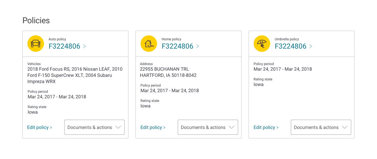
Ideation & Wireframes
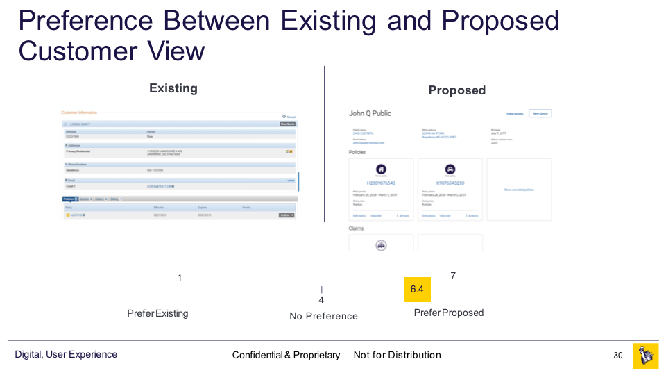
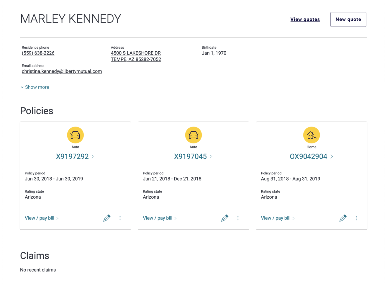
I knew I wanted to move away from the tabular approach used on the original overview screen. I felt that two or three cards per customer overveiw would help increase the prominence of call drivers. The cards themselves allowed for both a much larger touch taget for the primay action (view policy) as well as offering an opportunity to surface secondary and tertiary actions.
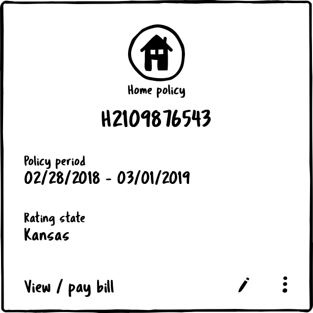
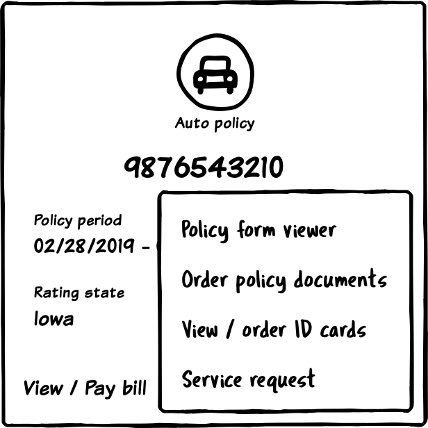
Prototype & Testing
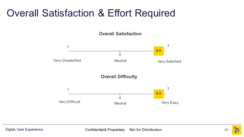
With cards in hand, I then put together a couple of prototypes to test in InVision. Our UX researchers conducted moderated studies with about a dozen agents. User feedback was very positive, but we made note of possible improvements.
Visual Design & Components
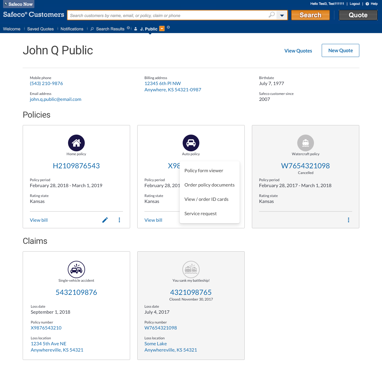
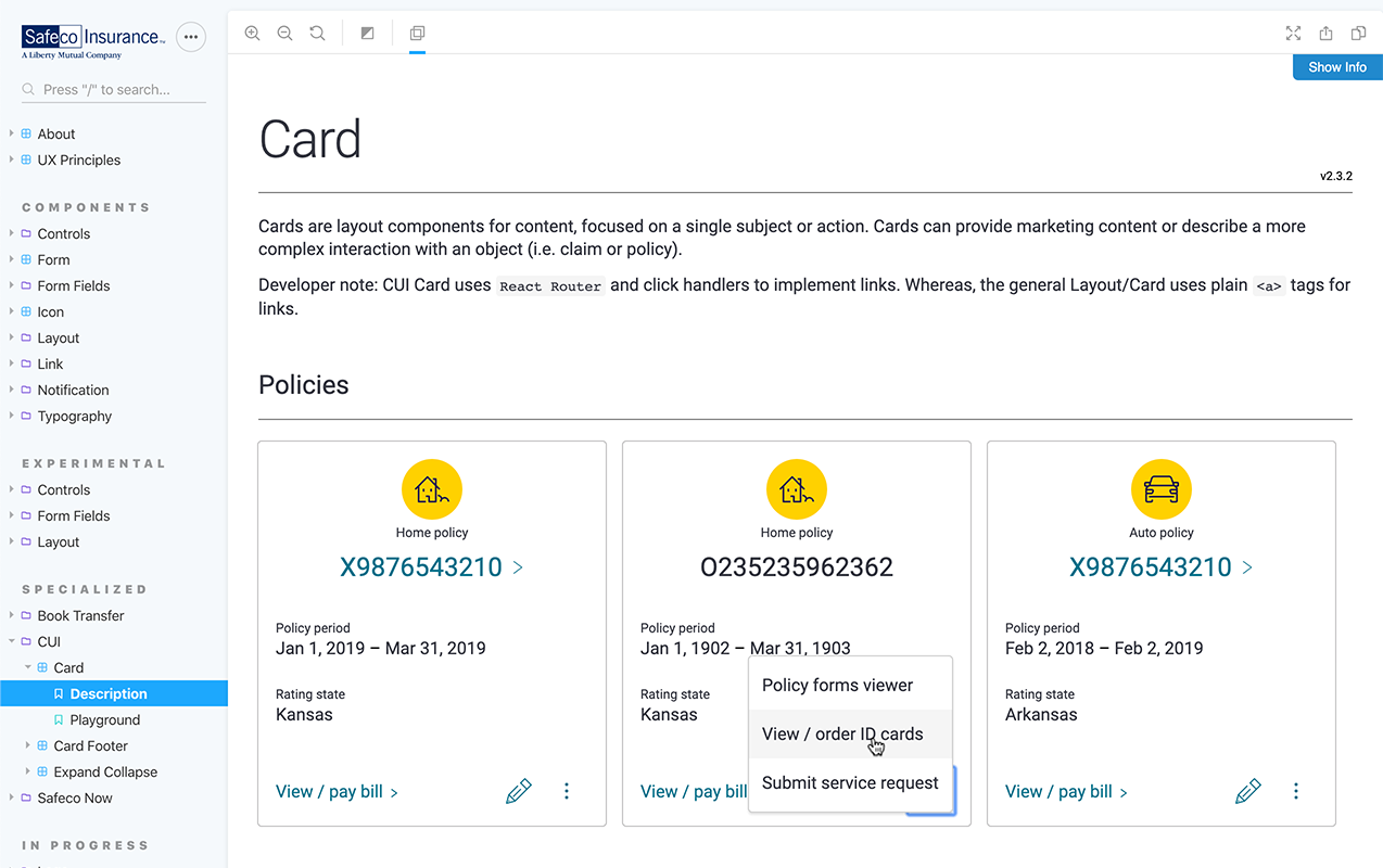
My focus for this project was to design a simple to understand user experiences. Internally, I worked with a visual designer to apply or create design system elements. I also provided code and documentation to our components team to make sure everybody was on the same page. The finalized card components below were then incorporated into the project by the squad developers.
Before & After
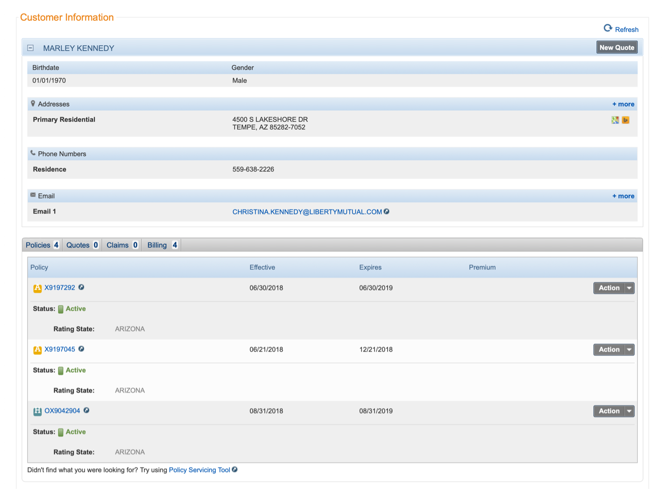
This project was basically a UI refresh, with no changes to underlying code or functionality. That said, the updated design offers a more modern look and feel and brings this experience into alignment with our current brand and build guidelines.
Refinement
The updated Customer Overview experience went live in the middle of September, 2019. October usage was the highest on record, but over the following weeks, we learned that there were still opportunities for improvement. On the content side, we gained access to more in-depth policy information. This added information, along with updates to our design system, offered an opportunity to rethink the basic card components. We're also hoping to improve access to less common actions and documents related to each policy type.